Data
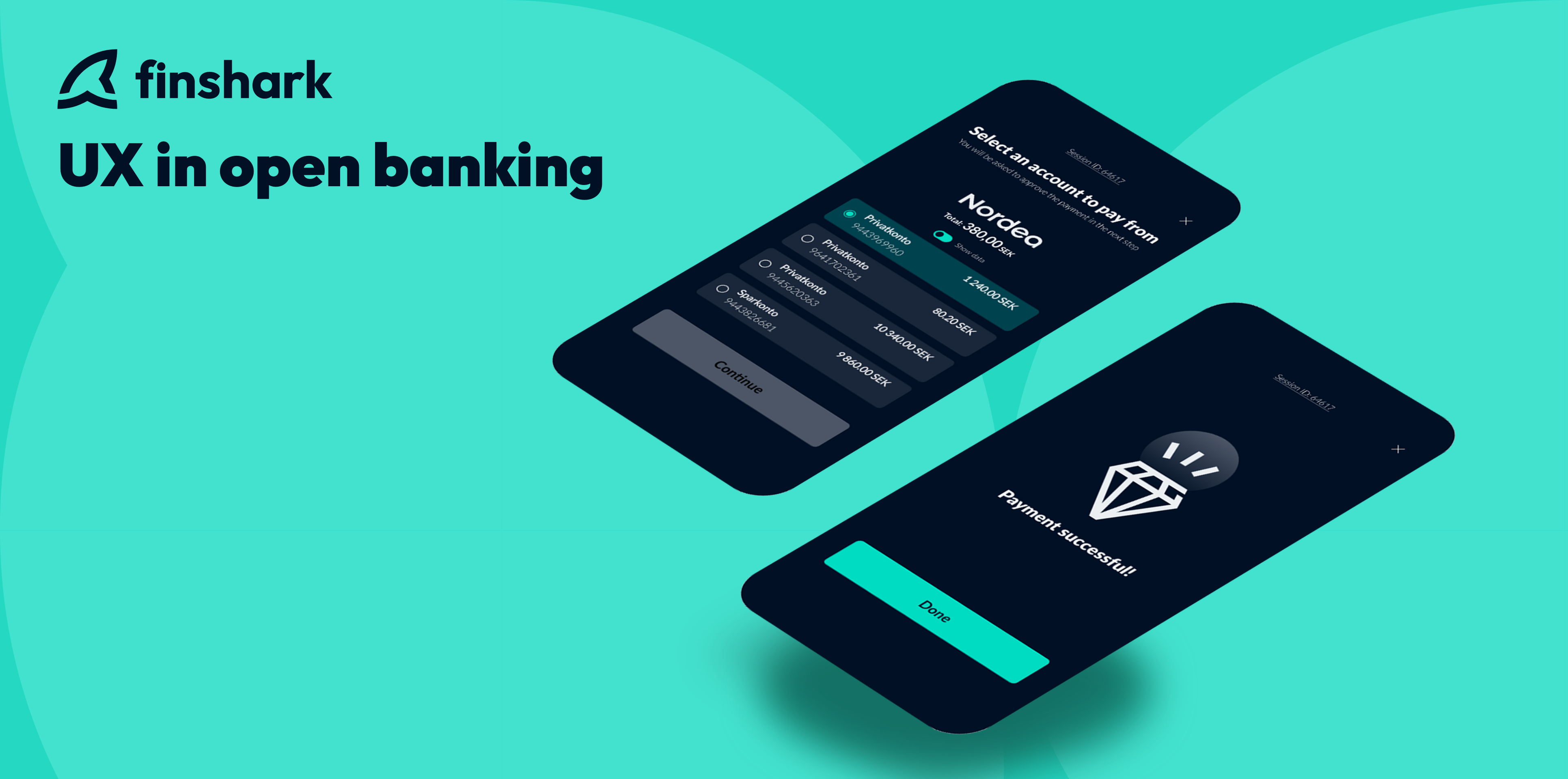
The methodology of UX in A2A payments.
In recent years, there has been a remarkable surge in the popularity and demand for direct payment solutions. This phenomenon can be attributed to a range of factors that centre around user experience.
UX plays a pivotal role in the success of direct payments, highlighting its utmost importance in this domain. In a highly competitive digital landscape, where user expectations are continually evolving, prioritizing UX design is key to gaining a competitive edge. By using methods directly from the UX book such as prioritizing ease of use, efficiency, and security we create a seamless and trustworthy payment experience. That establishes direct payments as a preferred method of transaction.
The impact of a well-designed direct payment journey on user behaviour encompasses:
- Increased user satisfaction – Providing a smooth and hassle-free payment experience leads to a higher likelihood of repeat transactions.
- More frequent purchases – Encourages users to engage with the convenience and efficiency offered by it.
- Increased customer loyalty – The establishment of trust and credibility through design and security measures fosters user confidence.
We will embark on a journey behind the curtains of Finshark and our approach to user experience in democratizing payments. This is just the beginning of an exciting exploration that will unveil the secrets behind their success.
Addressing pain points.
“I wish that the checkout could have lasted forever”. “What I love the most about shopping online is the payment part”. “More forms to fill out would have been nice”.
These are some sentences you will never hear. The culprit? Years of tedious payment processes and a tendency adopted by some companies to focus on maximizing profits rather than striving to increase retention rate by having a super-easy checkout process. And here at Finshark, we wanted to know why and how they could be made a little more bearable.
Addressing pain points in direct payments is crucial for creating a seamless and user-friendly experience. Here are several effective strategies to tackle these pain points and enhance the overall user experience:
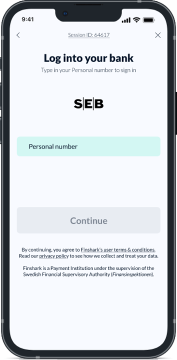
Excessive personal data requirements.
This can act as significant deterents for users, especially in light of growing concerns about data privacy and security. Users may feel reluctant to share extensive personal information, potentially perceiving it as intrusive or invasive.
We have an upper hand in this case, since we use an electronic identification system (such as BankID, MitID among others), and it’s all regulated by the Swedish Financial Authority. Immediately cutting the steps down to just filling out just one form field and pressing just one button in your authorization app.
Cluttered screens, confusing layouts, and unintuitive navigation.
When payment screens are cluttered with excessive information, buttons, or visual elements, it overwhelms users and hampers their ability to focus on the most critical tasks. Clutter can cause information overload, making it challenging to locate specific features, account details, or perform desired actions. The lack of visual hierarchy and organization can lead to a disjointed and overwhelming user experience.
We use a very controversial system some companies shudder at its mention; KISS (Keep it simple, stupid). I know, right? Streamline the user interface by prioritizing essential elements and minimizing visual noise. Employ clean and minimalistic design principles to provide a visually appealing and uncluttered interface. Use whitespace effectively to separate and organize elements, allowing users to focus on relevant information. That’s all there is to it!
Simplifying the process.
When users initiate a payment, they should be guided seamlessly through each step, knowing exactly what to do and how to proceed. Clear and concise instructions should be provided, accompanied by intuitive visual cues and well-designed interfaces.
Good interaction design is about keeping things obvious.
Be it restraining complexity, simplifying the complex, or making a way forward clearer. When a user submits their data, it’s important to make sure they know their information has been received and processed.
Here are a few things we put extra emphasis on when working on our UX.
Putting the users first.
By adopting a user-centric approach, app developers can ensure that users understand the payment process and are able to navigate it effortlessly. Some common questions we asked ourselves while coming up with a design for our open banking flow:
- Do users get stuck?
- If yes, where do they get stuck?
- Do users know what to do next?
- Are users clear with when and how to pay?
- Is the flow clear without much or any reading required? (Is it intuitive?)
- How do users know what to do?
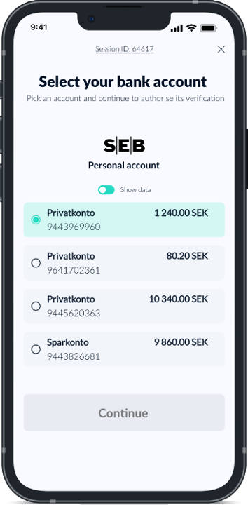
Common areas where users get stuck include inputting payment details, selecting payment methods, or understanding error messages.
Additionally, users may struggle to know what to do next, lacking clear guidance or a visual roadmap of the payment flow. Clarity regarding when and how to pay is crucial, as users need to be informed about every detail in the payment process as we always deal with sensitive data, and it is crucial that users feel that their personal information is safe and secure.
Streamline payment experiences.
To ensure a seamless and intuitive experience, the payment flow should be designed to minimize the need for extensive reading. Instead, visual cues, logical sequencing, and intuitive interfaces can guide users on what actions to take and when, empowering them to complete the payment process with confidence and ease.
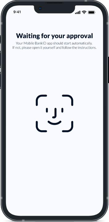
Communicate load times.
If there’s a delay in processing, it’s crucial to communicate this clearly to the user. Especially for important transactions, it’s essential to keep the user informed and engaged. Don’t leave them guessing or wondering if something went wrong. Instead, provide obvious visual cues or messages that assure them the page is still working. It’s better to be straightforward and avoid overcomplicating things.
The user is the king in our eyes.
– Adi Pandzic, UX-designer at Finshark
And a king will punish you harshly when things don’t go their way. So, the main goal is to reassure the user that their data has been received and is being processed, even if it takes a bit longer than expected.
By understanding the frustrations and challenges users face, we can reshape the way they interact with our products and services. As we continue to refine and optimize our UX strategies, we have the opportunity to build strong connections with our audience and earn their loyalty.
Together, let’s strive for grounded solutions that bring value and make a real difference in the lives of our users.

Linus Logren | E-commerce payment specialist
Payment specialist in the e-commerce and marketplace sector. A decade of experience working with e-commerce as a business owner, marketeer and consultant.
Connect on LinkedIn!